MilSO
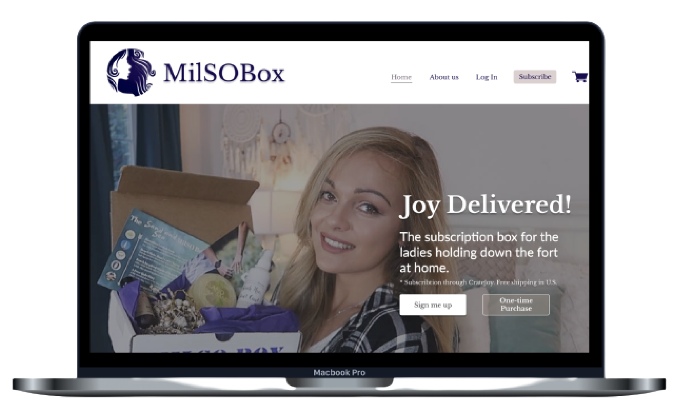
The subscription box for the ladies holding down the fort at home.
MilSO Box is a subscription box service for women who’s significant others serve in the military or armed forces.
Overview & Limitations
MilSO Box uses two different platforms for sales, a Wix website for information and marketing and a CrateJoy site for all aspects of the subscription process. Our client was committed to using CrateJoy to manage subscriptions and user data, but there were some design inconsistencies across the two sites causing customers to drop-off when redirected.
In effort to increase subscriptions, we set out to enhance the subscription user flow. Because our client uses Wix and CrateJoy, it was important that any design decisions we made could fit within the two platforms design limitations.
Research
We were granted access to both the MilSO Wix website and the CrateJoy site to see the site performance analytics. This allowed us to pinpoint areas of improvement. The CrateJoy site showed a 1.43% conversion rate. (Average e-commerce conversion rates are 1-2%.

Wix website Analytics - March 2021
258 Visitors
86 Product views
11 Added to the cart
3 made a purchase

Cratejoy Analytics - February 2020 - February 2021
2565 Visitors
224 Entered Subscribe Flow
85 Reached checkout page
44 made a purchase
Competitive Analysis
We analyzed multiple subscription service websites as well as other businesses’ that also had CrateJoy sites. In doing so, we were able to identify areas of improvement for the MilSO website and MilSO CrateJoy site. We wanted to:
Create a consistent design across the two sites, and link the sites both ways
Incorporate more images - our client has done an excellent job of photographing the products and boxes.
Make the CTA clear
Avoid having repetitive information/questions between the two sites
Keep images and content consistent across both sitesross two platforms


Existing User Flow
Proposed User Flows

Existing Website

Design the Solution
When designing our high-fidelity prototype, we wanted to create a modern site, that provided clear and straightforward information on what MilSO Box is and how someone could subscribe. It was important that the user be made aware early on in the process that they would subscribe through CrateJoy.


Iterate on Designs
Be upfront with costs
We added subscription information to the MilSO Box homepage and using icons, show customers how much they can save through the different subscription packages.


Paint a clear picture for the users
Users really wanted to know what would be inside of their MilSO box; however, because each box every month has a new theme and is thoughtfully curated with different products, what’s inside the box is actually a surprise. We updated the content to give customers an idea of what could be in their box but also make it clear that is a surprise box.
Improve navigation
Many users were confused by the shop button in the navigation bar. Users either thought they could purchase individual products there or that is where they would sign up for the subscription. In effort to avoid confusion, we removed the Shop page from the navigation bar, but kept the one-time purchase button. If a user clicks on the button, they are taken to the hidden shop page, where they will find boxes that they can purchase.

Project Takeaways
To see the final prototype, click here.
This project pushed me as a designer but also made me a better communicator. Working with a co-designer, it was so important for us to be in constant communication. We challenged each other multiple times with different opinions - but were able to make decisions backed by research.
I think we did an excellent job of keeping our client’s needs and business goals in mind, but we also made sure to keep her in the loop. We made a point to have weekly meetings so that she could provide feedback along the way. I know she really appreciated this and actually sent my co-designer and I each a MilSO box - it was awesome!